chalk and pencil

fonts. drift and adrift had been my goto fonts for several months. Highly legible, its glyph set even influencing my source code fonts.
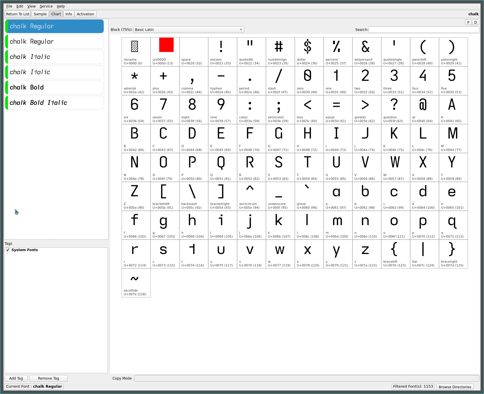
chalk and pencil bring a return to my geometric/Univers Grotesk leanings expressed in earlier font sets, notably with the lower case extended f, single-storey a and (newly introduced) ascending l, and descending glyphs unique to the fonts created on in this site.
chalk

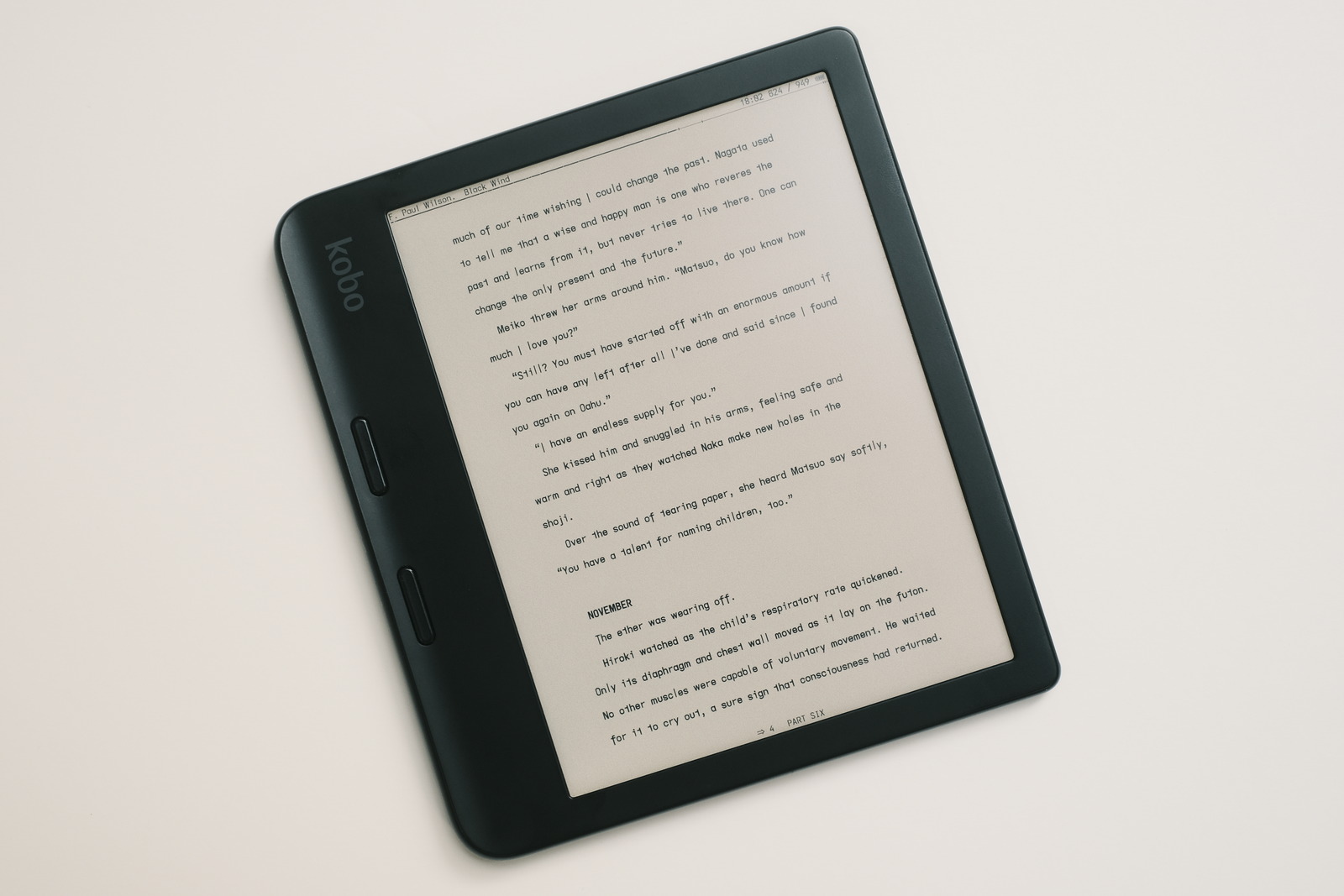
is used by me for the header/footers of KOReader—my ereading app of choice. Without the descending caps, chapter headings and book titles register in a familiar way—noticeably, Roman Numerals—compared to the pencil font.
pencil

however, is my current favourite font for text. This is not a font for the visually impaired (like drift and adrift), the single-storey lower case a being less legible than its double-storey counterpart and the ascending serifless lower case l differentiating itself from the descending capital I only by its cap height or stroke length—a nod to the Futura font.
There is a slight feathering between lines—this font is meant to be used with adequate “proofing” line spacing for readability—with the extra descending and ascending glyphs but this is more than mitigated by the increased openness of the font with its serifless capital I and lower case l, and single-storey a. Lines of text look visually less dense, particularly noticeable with the ea bigrams—this combination is arguably more legible, especially at small font sizes.
The extended lower case f, ascending l and, descending capitals I J and T, add a flair to the font set, with the descending capital I and T glyphs adding a unique emphasis to the printed narrative.
Despite violating the “non-mirrored glyphs” design of fonts on this site for readability purposes—with the serifless capital I and lower case l—pencil’s geometric/Univers Grotesk influences render an exceptionally clean typeface. As always, YMMV.
comparison
| upper case | drift | adrift | chalk | pencil |
|---|---|---|---|---|
| (eye) I | serifless | descending- serifless |
serifed | descending- serifless |
| J | flat-hook | flat-hook | flat-hook | descending- flat-hook |
| T | serifless | serifless | serifless | descending- serifless |
| lower case | drift | adrift | chalk | pencil |
|---|---|---|---|---|
| a | double-storey | double-storey | single-storey | single-storey |
| f | serifless | serifless | serifless | extended- serifless |
| (el) l | hooky | hooky | serifless | ascending- serifless |
| (tee) t | *reversed* hookless- asymmetric |
*reversed* hookless- asymmetric |
*reversed* hookless- asymmetric |
*reversed* hookless- asymmetric |
wheras, adift merely adds the descending capital I to the drift font, pencil adds descending and extended glyphs to the chalk font rendering it the most unique of this font group.
The reversed asymmetric lower case t remains (uniquely) common to these fonts—this and the descending capital I as signature glyphs.
ascending l
when the exploration for a more geometric font face began (with a return to the single storey a), the standard cap height serifless lower case l was an obvious glyph choice. This required the use of the serifed capital I (despite my serifless bias) for the header/footer typeface to distinguish itself from the serifless glyph but can be considered a positive trade-off, especially for Roman Numeral chapter headings and the confinement to headers and footers—some may prefer it as an all-around font with all the benefits of its non-mirrored glyphs for readability minus the less familiar descender glyph shapes.
While the serifless l definitely yielded the cleaner typeface sought, it felt less effecive in the text body (to these eyes). It imparts a more “static” feel to the text (IMO)—hence, its suitability for headers and footers—due, in part, to its lack of visual distinctiveness (from the descending capital I, lessening readability).
Enter the ascending serifless lower case l. Like the descending capital I, its stroke length adds significant visual distinctiveness to the glyph to increase readability on the page and be suitably distinguishable from the descending capital I. And further adds a touch of flair to the typeface and, importantly, adjacent letter combinations.
As always, YMMV.
repos
These fonts may be found on OneDrive.